

Shared this on IG.. Hope this helps!
•Clear stamps – there are loads of choices out there. Choose something that you know you will not mind using over and over. On a budget – try to shy away from the heavily themed ones, say Christmas.. Valentines.. Graduation.
•Tape Runner – clean and easy to use, i cannot express how happy i am that this was invented!
•Cutting Mat and Cutting blade – the secret to washi stickers.
•Pen / Fountain Pen – this does not have the be a fountain pen nor should it be a damn expensive pen. Use what works for you, be it a pencil, crayon whatever. Just as long as you can write with it, it’s good enough to be on your desk.
•Journal / Planner – my Travelers Notebook and my Hobonichi. Do i really have to explain this part 😂 kidding, look for a notebook that will accomodate what you want it to be. More than anything, paper quality is everything to me. These pages can take pointed pen calligraphy and even watercolor.
•Watercolor – if i can only own ONE set, it would be Prima’s Decadent Pies. It comes in a handy friendly black tin that i can bring anywhere and everywhere.
•Ink pads – if you want to play it safe, go for Versa Magic chalk inks. They dont bleed on to the next page. The dye ink that’s really gentle that i have tried is Prima’s color philosophy pads. Did you know you can use them for watercolor as well.
•Stickers / Ephemera – i never outgrew the love for these!!
•Washi Tapes – one can never really have too much but you have to know what you want, what fits your style and what you can use in a long term perspective. I had a time where i destashed my cutesy washis because it really wasnt me. I tried but it gave me the heebeeejeeebies.
•Inks – specifically for fountain pens. There are small bottles that you can try out before you start hoarding the medium sized ones. I prefer JHerbin because it dries quick enough that i dont end up smudging my pages.
•Organizer – i have a thing for wood, if you have not noticed yet. I like my stuff clean and it’s proper place when im not messing around my workspace.. Now you see the entire picture!
•Pencils and Erasers – no one was born an expert. Like it or not, you will need to draft or sketch illustrations before you can even start inking them in.
•Tape Dispenser – dont ever take this for granted. TRUST ME.
Be Inspired but Don’t Copy

Personally, the only time it is fine to copy someone’s work is when you’re learning a craft. It develops muscle memory. If you want to share your work as progress against something you copied, i strongly suggest you credit the person who inspired you. By not doing that, you’re just as good as saying that it was your own creative idea.
The most important thing: learn from what you are copying.
Why did you choose it in the first place?
The color palette – then create your own swatches of hues to use.
The layout – then mix and match where words are placed.
The theme – peruse through inspiration boards, observe what strikes you.
The quotes – is there even a lack of supply for this?
The world of social media is not as big as you think. There will be friends of friends of friends of their friends who will see what you eventually share and it will reach the original artist.
This is just MY take on it, i am more amazed at the people who even sent me messages saying that they try to copy and learn from my stuff. Seriously, i do this for fun but if you’re learning from it, im going to cheer for you. That’s also why we enjoy hosting workshops! We love to share but please, have the common courtesy of at least giving us credit when you do copy our work.
Zig Clean Color Real Brush 80

I started early 2015 trying my hand on Brush pen calligraphy. That was the time that i was introduced to the options of felt tip brush pens and synthetic ones. This is where the Clean Color comes into play.
It was not an easy pen to use for calligraphy when I tried it out at first. I only owned two colors at that time and I eventually chucked it out of frustration.
Months and months after, i gave it another try and it was finally working for me. You have to keep it mind that if you’re using this for calligraphy, you will be up for a challenge. The lightest touch of pressure will create your thick lines because these are similar to actual paintbrushes.
Before I get ahead of myself, I created a color swatch for those who are interested. I got the template from Jennifer McGuire Ink which you could download for your perusal as well.
Do note that the colors on the left of the name are the pens itself. The ones on the right of the names are the colors watered down – if you want to see the watercolor effect when you decide to do so. Advantages of the pen being waterbased!
I printed the template on 200GSM cold pressed watercolor paper. I prefer the texture, really.

On the righ side of the names, the swatches were diluted with water.

I write with the pen first and then I use a wet paintbrush just to go over it. Extending it to show how the brush can drag the colors.

I personally am smitten with the light and pale hues which I love to use in contrast when I use their darker counterpart.
Write-Ability: If you have been following me for quite some time, you know that my writing belongs to the much smaller scale.

This is how big it can get if I do Calligraphy. Do not expect precise and smooth edges when using these because they are bristles unlike the firm tips of felt brush pens. Write slowly to get ink flowing in a more solid manner. If you want the feathered effect normal paintbrushes work, quicker strokes for me tend to do that.
Keep in mind that when I dabble into lettering, I still use a pencil to sketch out what I write so I can adjust primarily the sizes of my letters accordingly.

Blending Colors: It has been easy to blend the colors (if you intend to use these for coloring) when i attempt to do lettering.
You may use the lighter shade to grab the darker color and transition them gradually OR you may opt to use a paintbrush to let water do the blending for you.

The “go” on the left was just blended using the Clean Color pens themselves. – the colors look more saturated and you can see that two shades were used.
The “go” on the right was blended with a wet paintbrush. The shades literally flowed and it’s seemingly smooth!
Should I hoarder? (order) – I use both techniques depending on what I need to do and what paper I am using. Though you may not need all 80 colors, I wanted all 80 colors! It is worth buying if you make it worth your time. Meaning; it may cost you much at first but if you see how much potential it has in your arsenal and take advantage of it, it is most definitely worth hoardering (ordering)
Did this make sense? I hope i was able to help you out on this. Let me know on the comments below!
*I bought this set on my own (okay, I lie – I used my husband’s credit card). I was asked to review and create swatches through Instagram but hey, if the products are nice; there’s no harm in sharing that it is!

Create The Bounce
One of the reasons why calligraphy has been so popular is because it celebrates “individuality”. Sure there will always be the clamor for the formal Copperplate and Spencerian way of writing – the rise of Modern Calligraphy has been embraced by letterform lovers from all over the globe.

The Bounce: I have been particularly fond of this style because it’s carefree and it combines most of the rules that I can bend (and break) altogether.

For this to work, you have to keep in mind that what is visually balanced may not be the same as it being aesthetically balanced.
 “sheer” and “bliss” may not be visually balanced though they have the same number of letters but with flourishes, it will appear aesthetically balanced. I hope this makes sense!
Back to the Bounce:

- Create an imaginary line and visualize the text you want to write. For this process, let’s refer to this as the baseline.
- Instead of writing ON the baseline, the words will instersect that line.
- Exaggerate your ascenders and descenders – these can be situated heavily above the baseline or below respectively.

That’s the quick tip and trick behind it. At least that’s how i would have explained it in a workshop. I hope this helped and i would appreciate your comments about it. Have fun!!
Pointed Pen & Its Frustrations
I never claimed that I’m the best resource person when it comes to Modern Calligraphy but I wanted to share this post mainly for those who have tried Pointed Pen Calligraphy and ended up just being more disappointed by it… It is not an easy craft to develop, to be honest. It’s even more of a challenge when you do not have the patience to keep trying. The struggle is real and that is something that I can attest to. I started my quest to learn Pointed Pen Calligraphy last November 2014.

Since then, I have never stopped writing and practicing. This is not an exaggeration – you can ask my husband. I would bring a jam jar of ink, nibs, holder and a notebook almost everywhere I go. I was determined to write better then I would try every free moment I get. I would take photos of my work just to see if I’m getting anywhere improving my writing. This was taken January 2015:

It was a little harder for me since I never really write in cursive.. In fact, I haven’t since I graduated from elementary but hey, the hand wants what the hand wants. I was stubborn and I wanted to do modern calligraphy! Months passed and I would ike to think that it improved. ( At least I hope it did )

I was faking it until I believed it was half as decent as I wanted it to be. It all boils down to practice and how much you want it. I still have so much to learn and develop but my point is this: it’s not something you can master overnight or in one workshop. A workshop, regardless of who your instructor is – is there to guide you, show you tips, hacks and techniques; not make you an overnight success. At the end of the day, your progress will depend on you alone.

Why am I sharing this with you? Because I know what it’s like to be frustrated and annoyed at something you’re trying to do. I have been there and quite frankly, i’m still at that stage. Just keep practicing.. Practice does make progress.

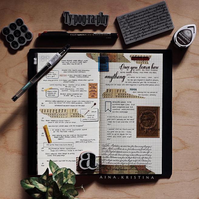
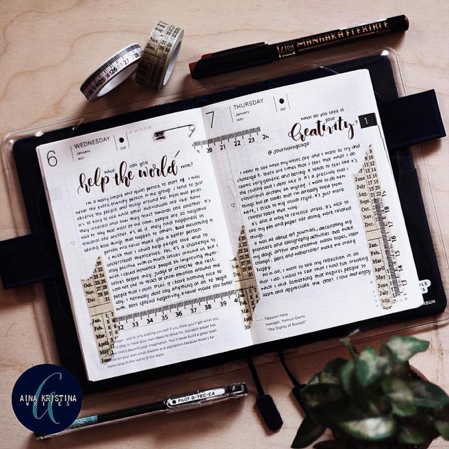
For The Love of Grids
If you haven’t noticed, i have always been drawn to plan and do my journals on grid paper. My original planner was the Midori Traveler’s Notebook since 2015. At least that was what I have been sharing since the past year. I didn’t expect that people would be interested in my planner and my well… handwriting. Who would have expected that i would end up sharing what and how i write… I’m not complaining because it is truly awesome that people are getting back on the habit of writing.
i think i deleted my old Instagram posts because it was getting a little crowded but anyway, this is how i initially did my art journals and their corresponding prompts… Sometimes, i just invent the prompts as i go and some, i promptnab from Journaling Sage and Life Captured Inc.
I am still using the MTN as my main planner and the Hobonichi Techo for my art journal. I love the smooth paper of both Japanese paper products. I am amazed that no matter how thick the watercolor or calligraphy ink that i use, it just does not bleed! Just a warning though, using Dye stamp inks will bleed on to the next page. You’re better off using chalk ink.
What’s your 2016 Planner?
Happy 2016, everyone!! Just like any other paper and pen addict, im so excited to use new and fresh planners!

I started 2015 with just the Traveler’s Notebook and nothing else. I absolutely love the simplicity of the system and of course, the grid lines that made writing a luxury.

Around mid September, a good friend of mine gave me my very first Webster’s Pages Color Crush. I have swooned over this planner for such a long time but I never bothered purchasing one because I value the quality of the paper. I used to have a Filofax and I was not fond of their inserts. As soon as i tried the Color Crush’s inserts, i was amazed at how well the pages held ink so well and didn’t even leave a mark on the next page.

To date, i have 4 personal sized ring planners and I’m expecting one more soon to arrive this week. – i am still contemplating on the Navy Blue Filofax… I gave away the inserts that were included in the Filofax and the Kikki K that i am currently switching around.

And just like the crazy hoarder that i am, these are the two A5 planners: Filofax Original in Nude Patent and Kikki K in Dark Cherry. Yes, an A5 Color Crush is expected to arrive this week as well.

I’m trying to keep this blog and my You Tube channel as updated as i can. Comment down below what you want to see next!
Will be sharing the Traveler’s Notebook and the Hobonichi Techo on the following post. 😊
The Perfect White Ink

I’m sure that almost every other calligraphy enthusiast is looking for that white ink that can make dark paper look so elegant and sexy. I have found that gorgeousness is Dr. Ph Martin’s Bleed Proof White.
Don’t underestimate this little bottle because you literally just add water and it makes magic. I normally just put water in the little bottle and just mix lightly – just the top part. I find this more efficient and practical because I can just keep it there. If i need it to dry out, i just leave the cap off for a few hours and the ink thickens into its semi-solid form again.

Smooth – this was the first thing that came to mind when i gave this baby a test run. I have tried loads of white ink and i could not get them to flow from the nib to the paper 😪 the struggle was real.
If you’re looking for an all around white ink, this is the one that I totally would recommend without batting an eyelash. This is available in Scribe Writing Essentials and Pensgalore 👍🏼

Webster Color Crush Lovin’
It has style and it has sass. I am absolutely smitten with the Webster Color Crush planner – this was an unexpected love at first touch. Its buttery smooth and soft PU leather adds charm and character to the planner. Before I get ahead of myself, here’s a quick peek in the box.
What’s in the box:
> 2015 Month & Week on 2 Pages Calendar
– the paper is THE best planner insert I could ever want!!
> Today page marker / ruler
> 5 Dividers plus one cover design and a sticker sheet
> Note pad

I like that it provides flexibility in it’s own way. You can change the inserts with anything that suits your needs. It comes with decorated pages that resemble scrapbook papers. I like the fact that you can take the pages from the binder so I can write and decorate comfortably.

It’s no surprise that I have been using the weekly inserts as my art journal. I enjoy decorating using stamps and brush pens. I doodle a bit too. It is one of the few planners that have really good quality pages that can hold ink well.

No bleeding and no shadows on the back – for both stamps and brush pen. On a side note: I prefer using chalk ink pads for stamping on the pages. Versa Magic works wonders and you could never go wrong with them. At 120 GSM, this is really impressive for planner inserts! Just the same, the simplicity of the design for the week on 2 page spread is not intimidating to use. There are also days that I use the day’s slot to jot down important matters that I have to attend to.

At the Memory Keeping section, I like listing the prompts that I will be using for the month. There are times that I make my own prompts there are also those moments that I just want to write! I like keeping things simple, I don’t really decorate as much ( Do i?) and I’m glad that some inserts are already pretty that I dont need to add anything else!

Available at Scribe Writing Essentials
Marryl Crafts Giveaway!
If this year could not be more amazing than it already is, Marryl Crafts took me in as part of their creative team! It’s exciting and something to look forward to during the weekends!

I have not been able to blog lately but this is the start of something fun and exciting. In behalf of Marryl Crafts, we are hosting a joint giveway open to Philippine residents.
Click on this Instagram share to find out more!
